
I've spent over 30 years designing, for which I make no excuses. I’m a veteran creative. Most of it in branding, all of it chasing the same thing: work that earns a second look.
I spent a chunk of time as design partner behind Alexander Murray & Co., a whisky importer and bottler, building everything from full brand identities to one-off label concepts. That relationship taught me the real rhythm of this industry — the tight cost realities of glass and print runs, the way a label has to work at arm's length on a shelf and up close in someone's hand, the up close tactile elements, and how much a name can carry before a single drop is poured.
If you're building a brand in this space and want a design partner who understands both the story you're trying to tell and the practical reality of getting it made give me a shout via contact.
— Benjamin Čziller
POLLY’S CASKS (case study)
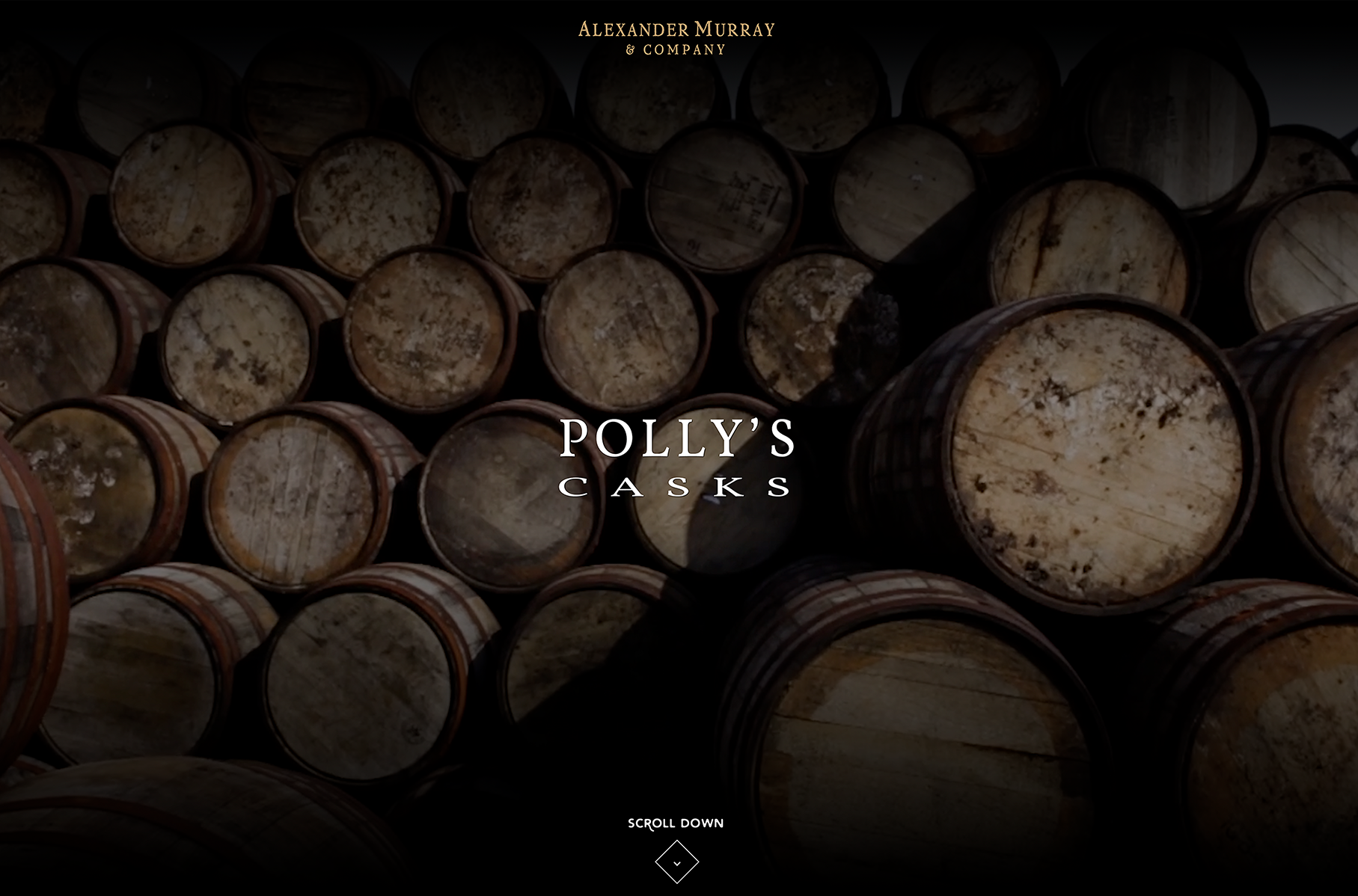
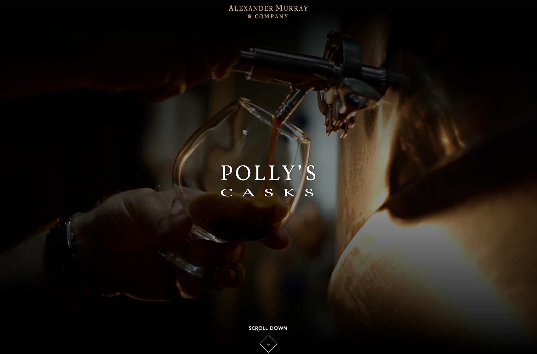
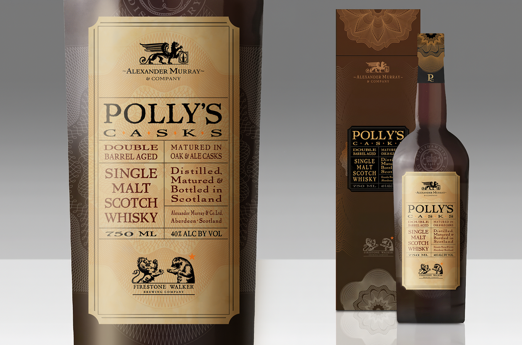
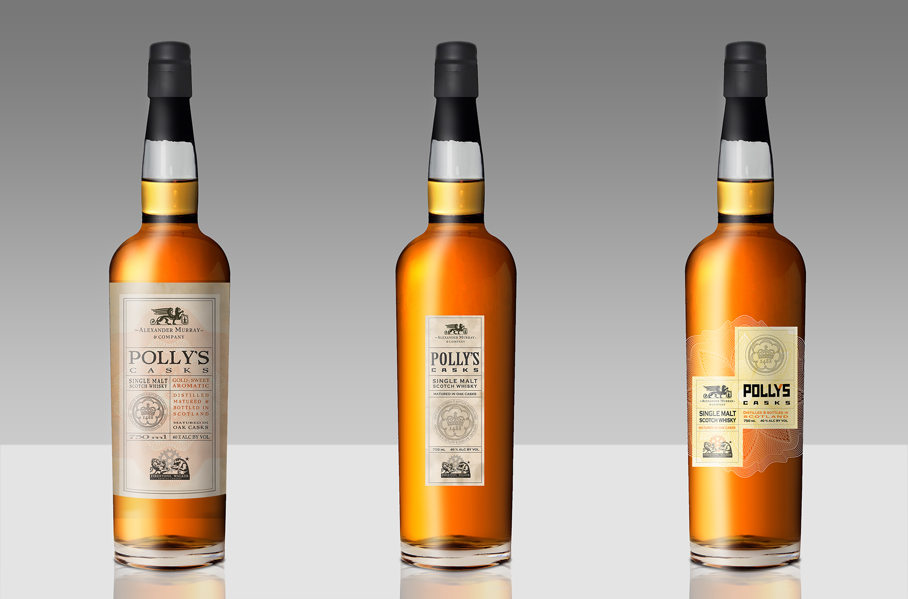
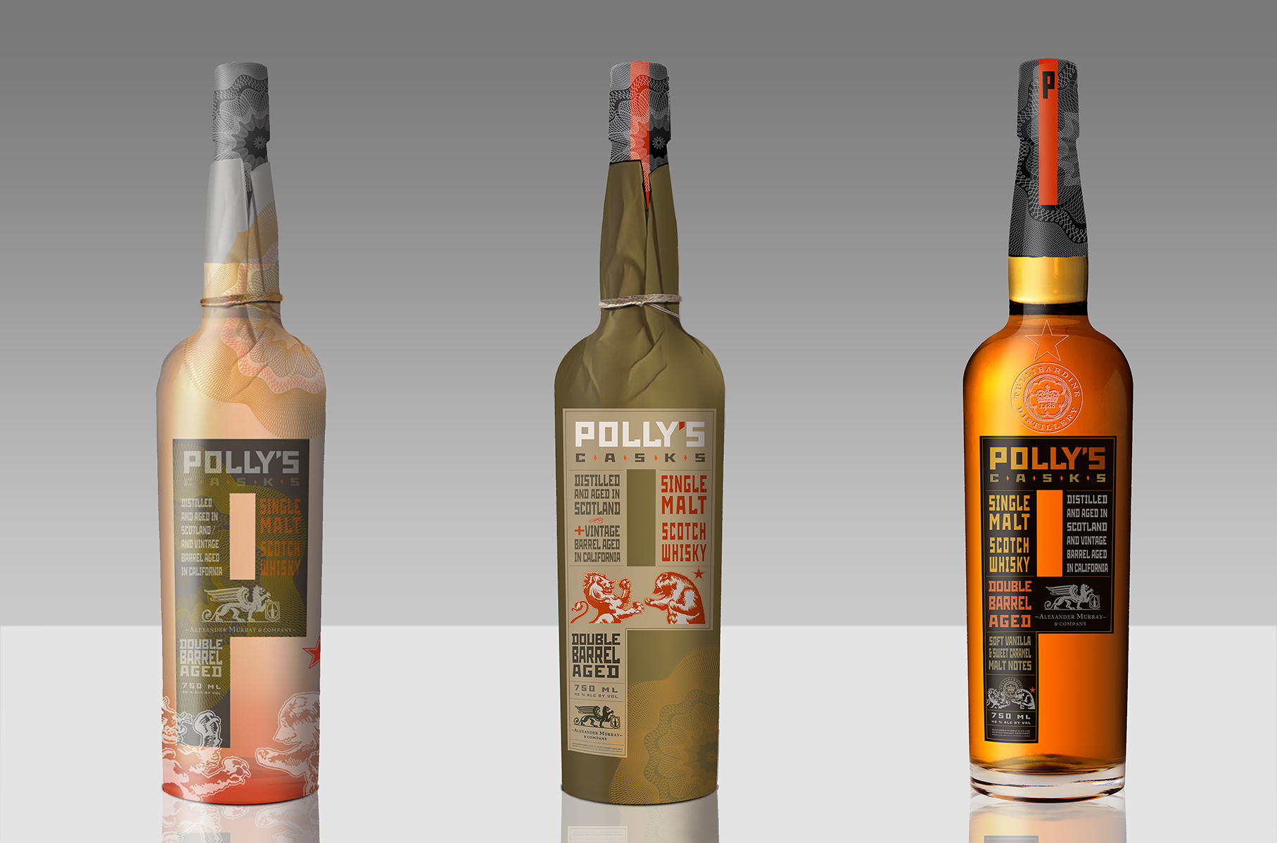
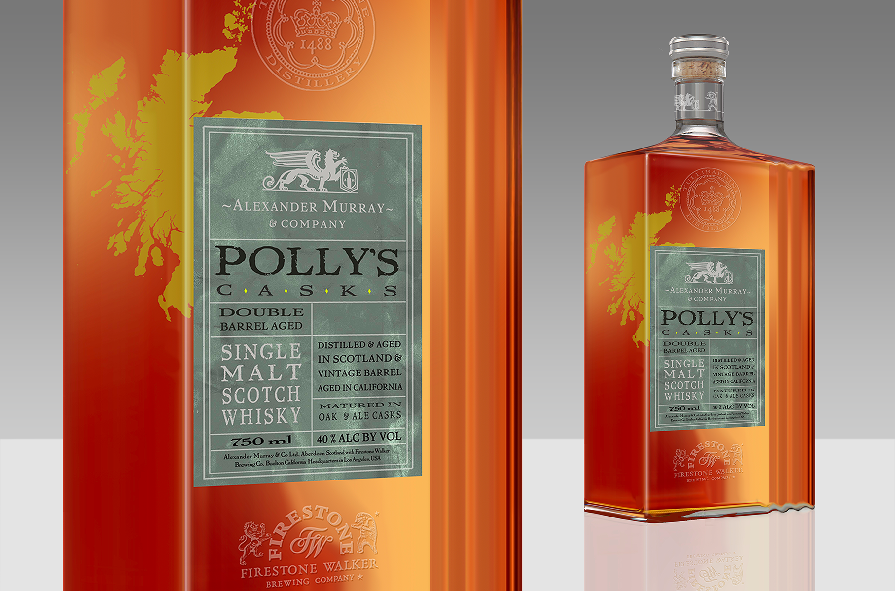
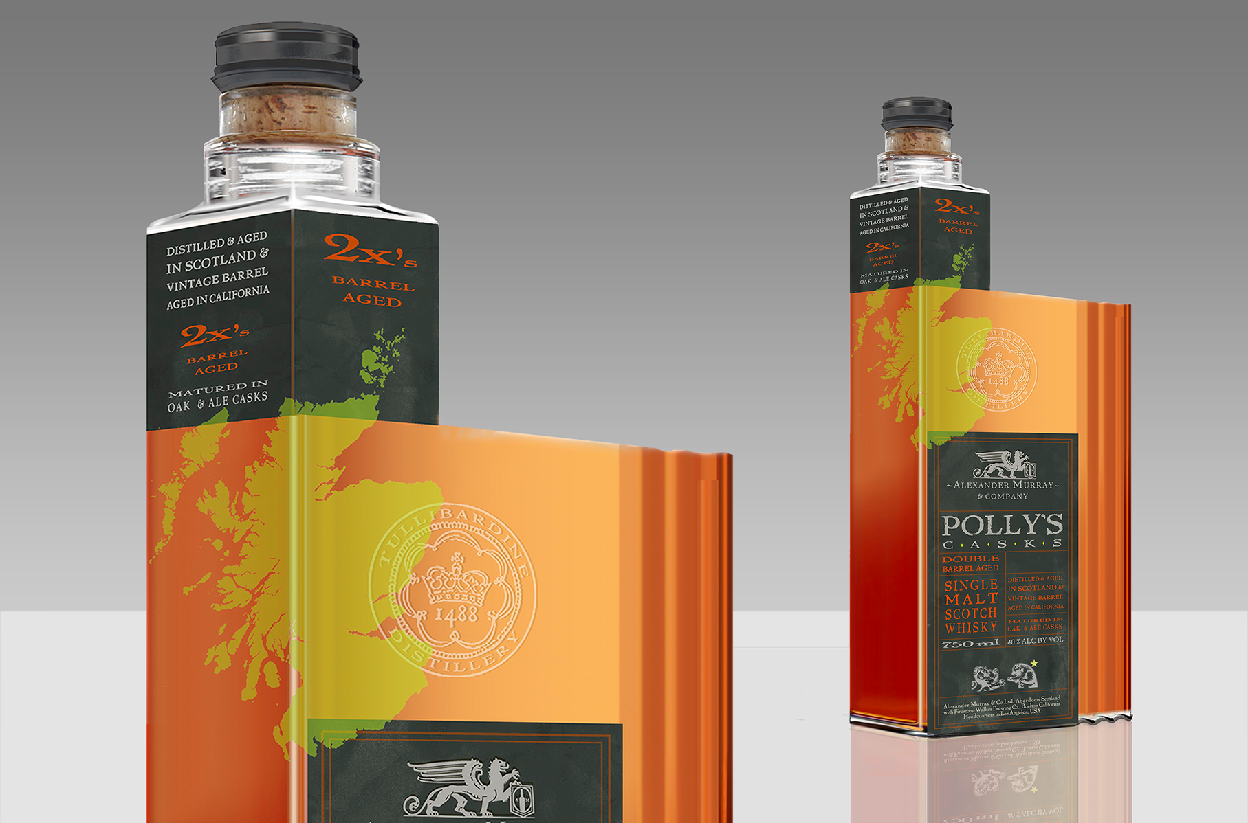
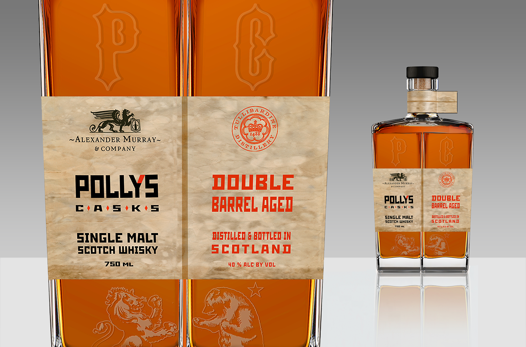
Concept
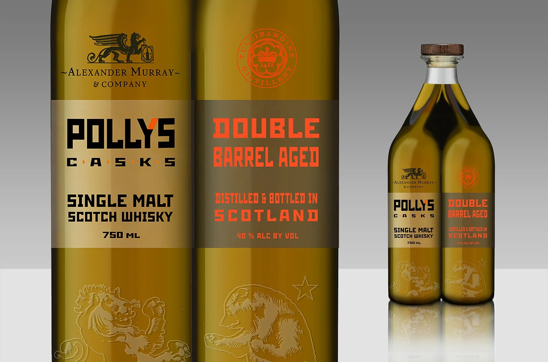
Polly's Casks is a collaboration between Alexander Murray & Co. and Firestone Walker Brewing Company — a single malt Scotch whisky finished in ale casks, bridging two very different brewing and distilling traditions in one bottle. The name and identity needed to carry both worlds: the heritage weight of Scotch whisky and the craft-beer energy of one of California's most respected breweries.
Process
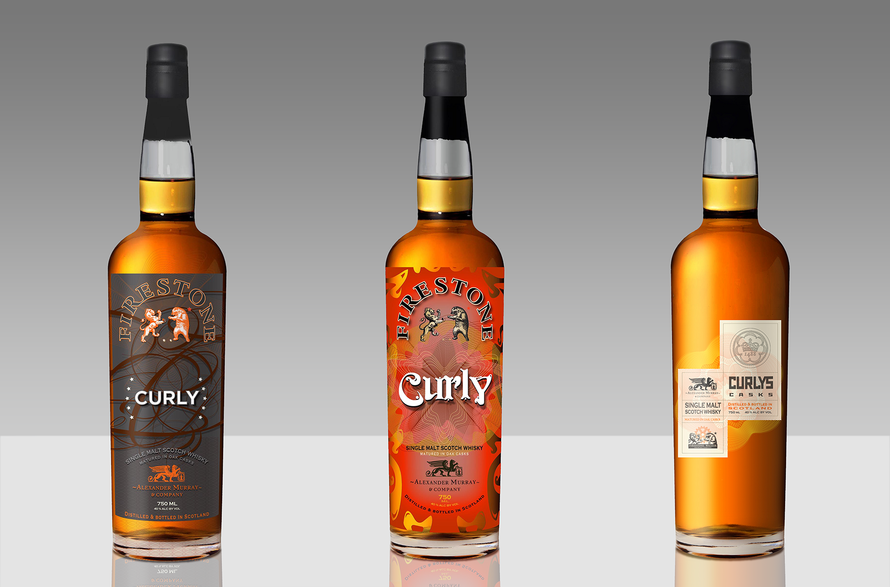
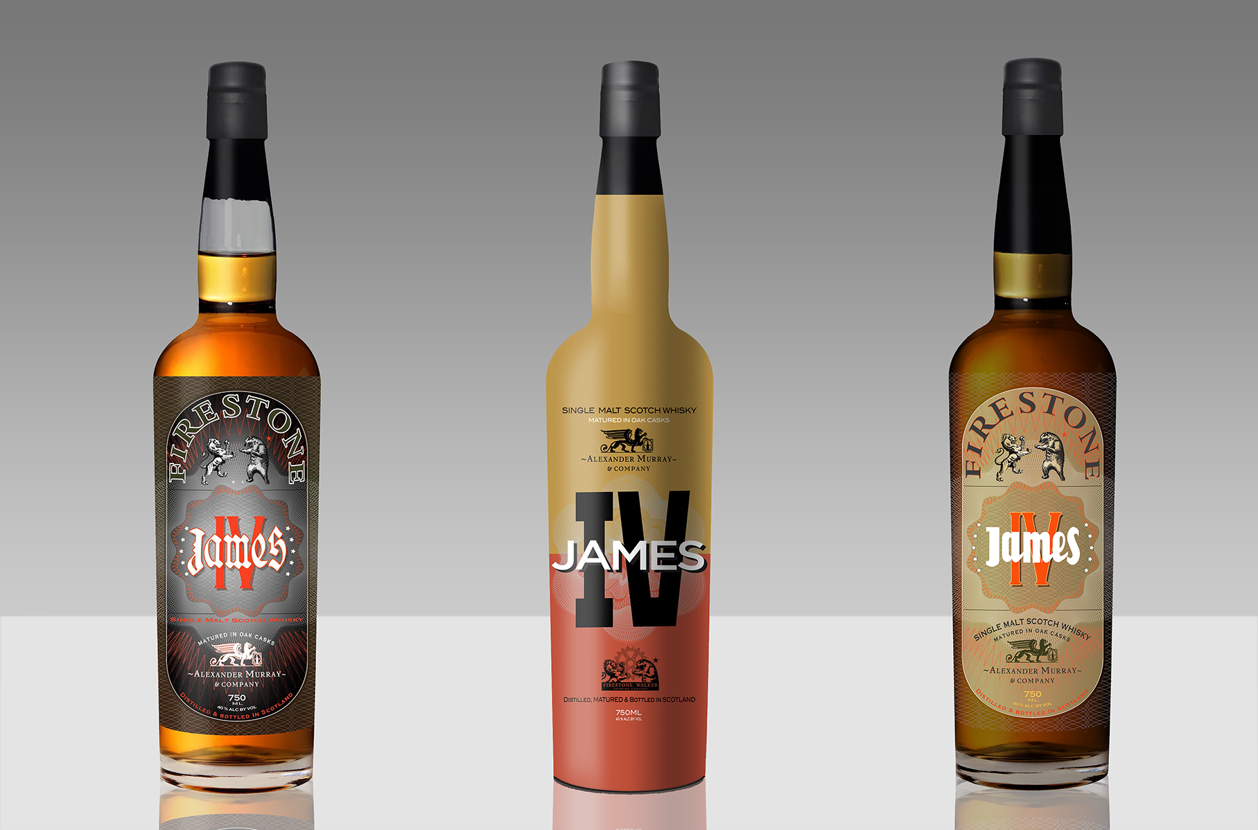
Early naming exploration ran through two full working directions before landing on Polly's. The first, "Curly," took its name from a personal detail — inspired by Polly's own hair — and was developed across two distinct label treatments, from a restrained geometric linework design to a bolder, illustrated flame-motif version. The second direction, "James IV," referenced the historical Scottish monarch and was pushed through six separate color and typography variants, testing everything from warm tan and deep charcoal to sunset orange and cool gray, each pairing a different type treatment for the name against the same core label architecture.
Alongside the naming work, bottle geometry was explored in parallel — including a custom faceted glass mold with embossed "P" and "C" initials worked into the surface. The bespoke mold was ultimately set aside for cost reasons as the project moved toward production, not because the design didn't work — a reminder that the best idea on paper doesn't always survive contact with a print run's real-world economics.
The final direction brought both threads together: the Polly's Casks name, paired with the Firestone Walker lion-and-bear crest atop a heritage-styled label, with "Double Barrel Aged" and "Matured in Oak & Ale Casks" doing the work of explaining the cross-category finish to a shelf browser in seconds.
AINSLEY BRAE (case study) Client: Alexander Murray & Co.
Concept
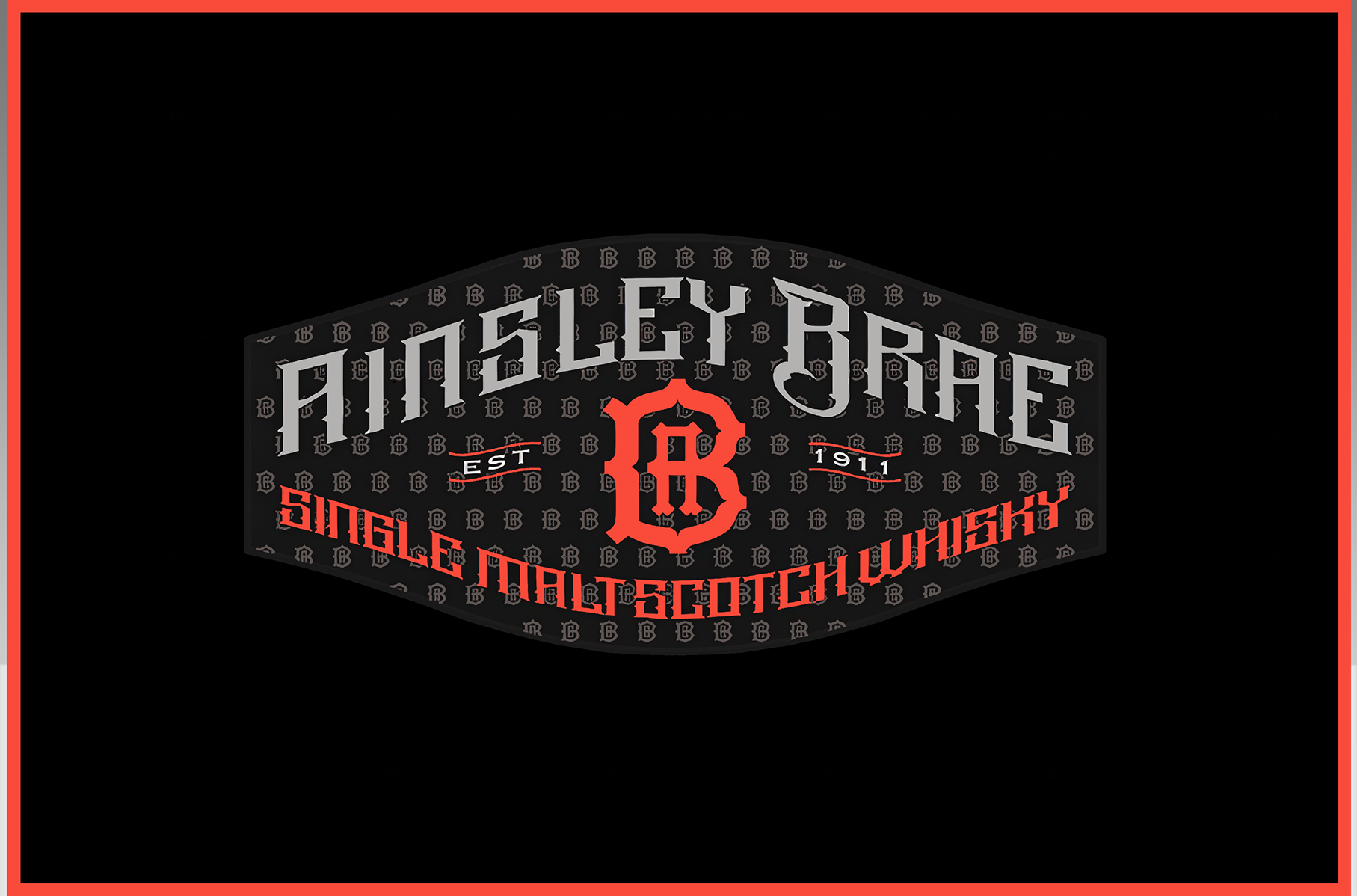
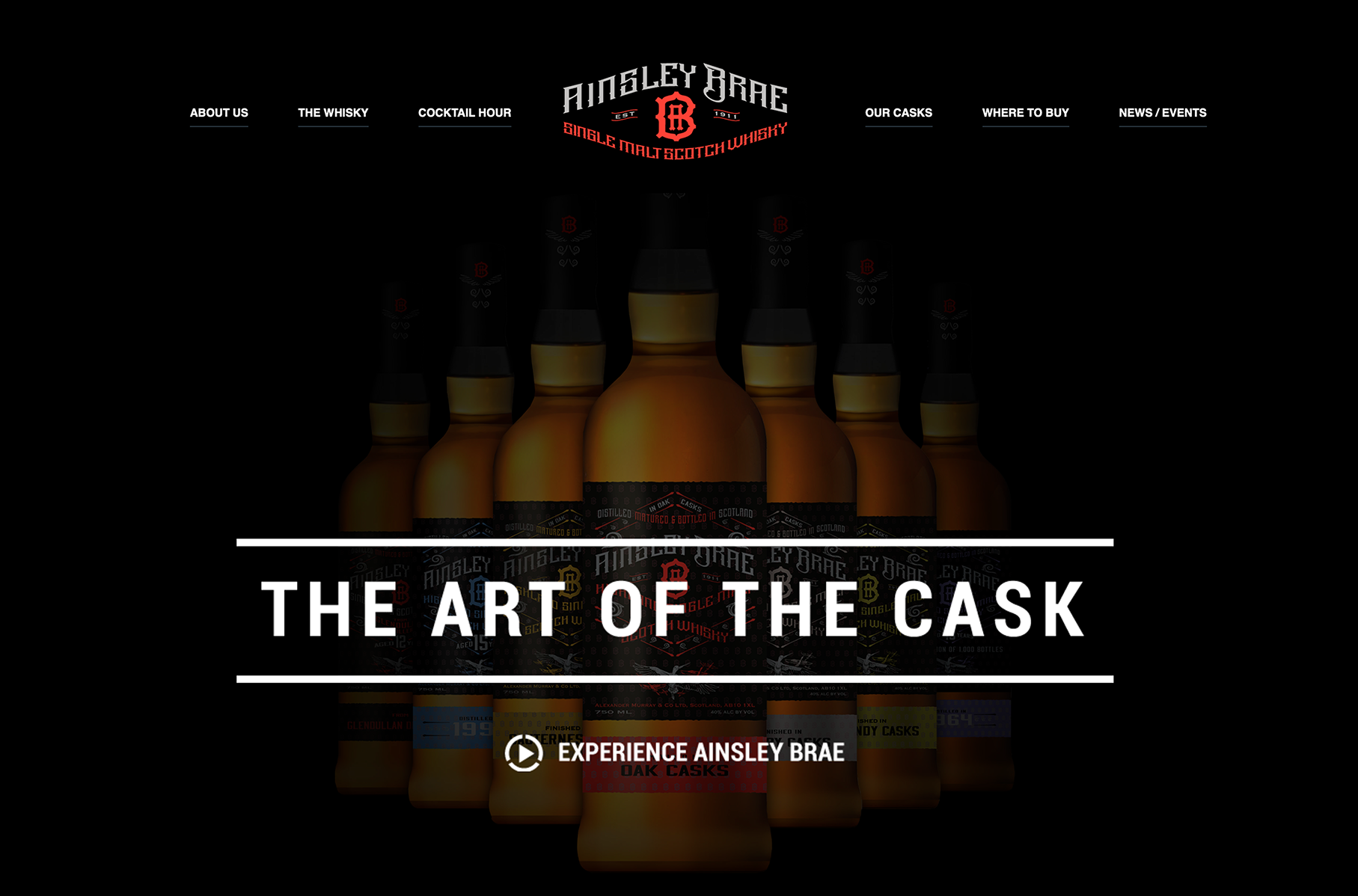
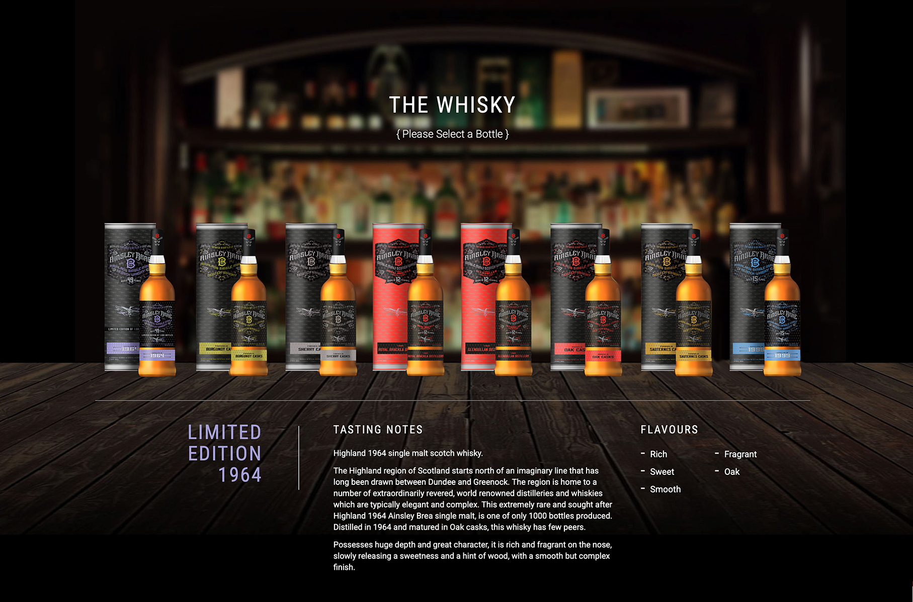
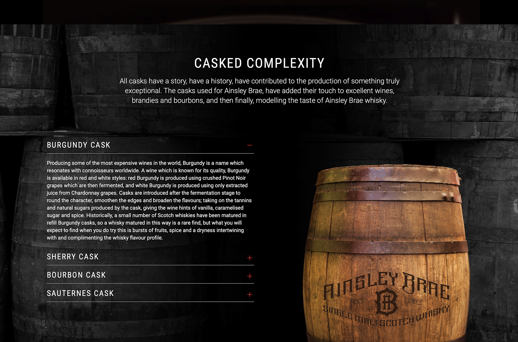
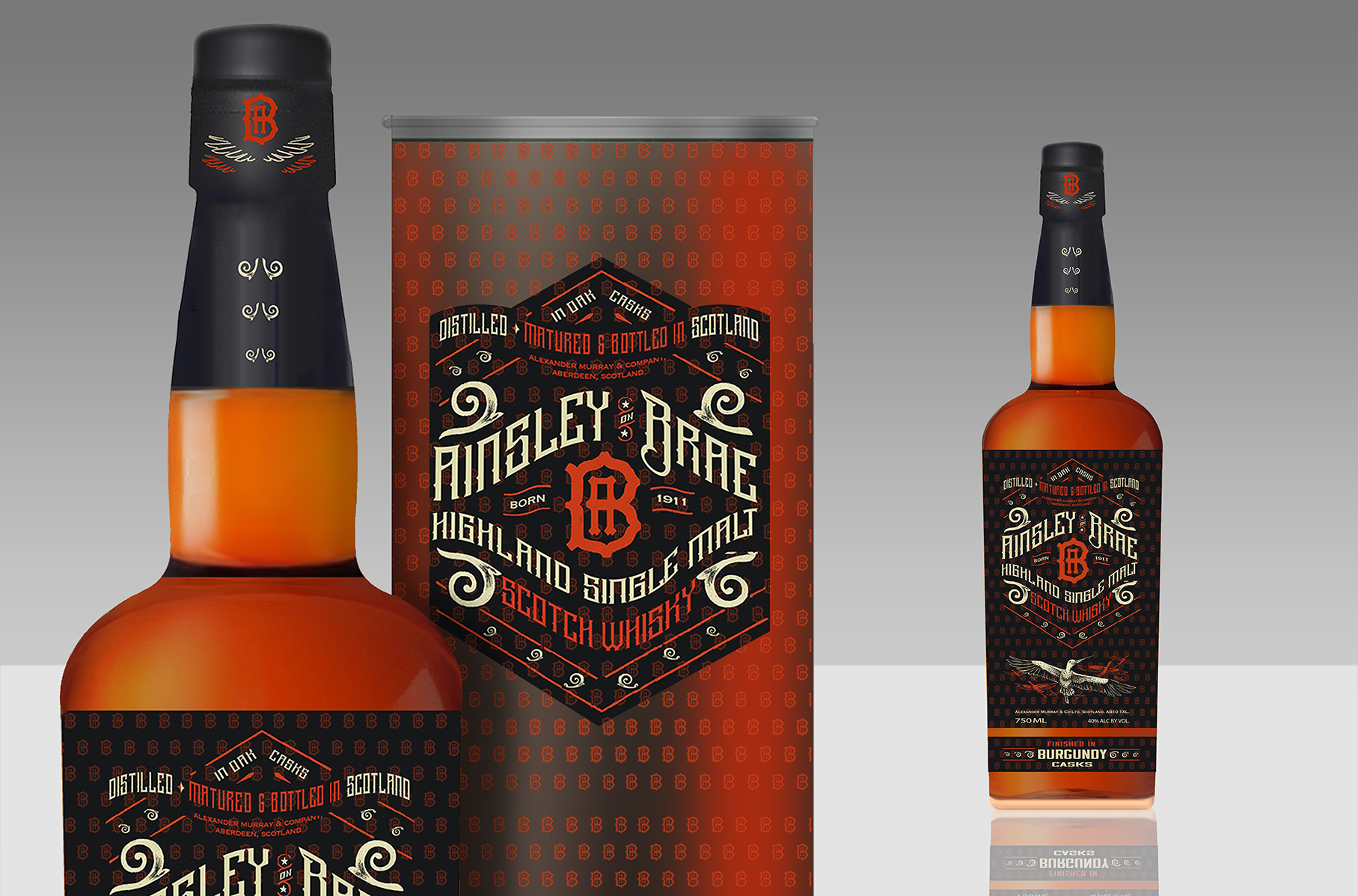
Ainsley Brae is a full brand identity and packaging system built from the ground up for Alexander Murray & Co. — naming, label architecture, and a range structure designed to scale across multiple cask finishes without losing a coherent identity. The brand launched at Total Wine & More and remains active today, with eight-plus finish variants in market. The Oak Cask expression went on to win a Silver Medal at the SF Spirits Competition.
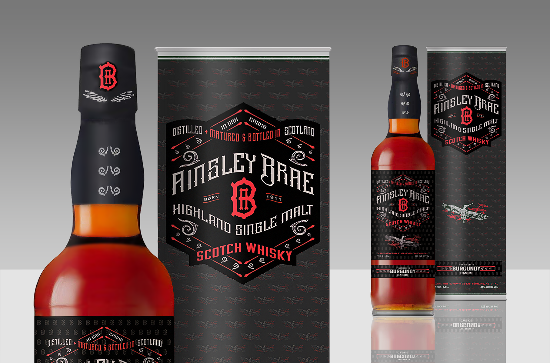
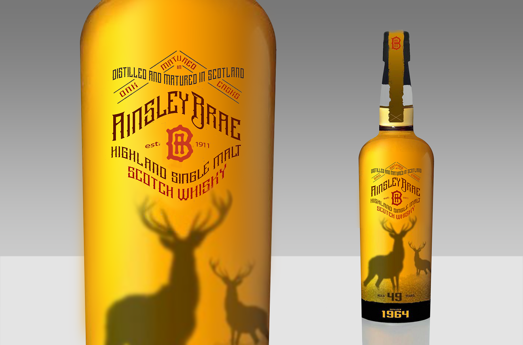
Coming up with a name which itself carries the brand's whole point of view: “Ainsley” is the Scots word for a woodland clearing, and "Brae" is the Scots word for a hillside or slope, grounding the identity in the Highland landscape without leaning on a real distillery name or an invented pseudo-history. The visual system — a red-and-black monogram crest, "Est. 1911" heritage marker, and a Highland stag motif — was built to read as authentically Scotch on a shelf while remaining entirely Alexander Murray's own.
Process
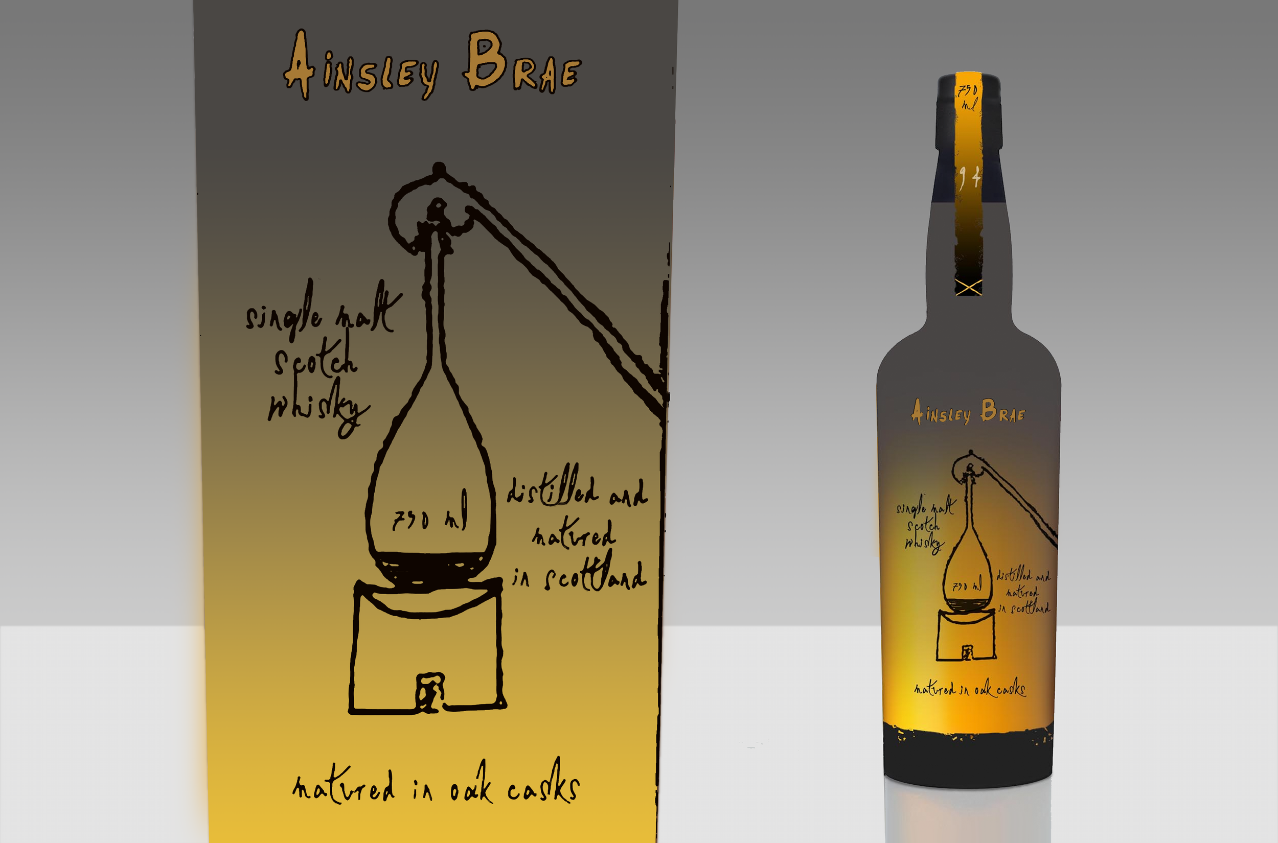
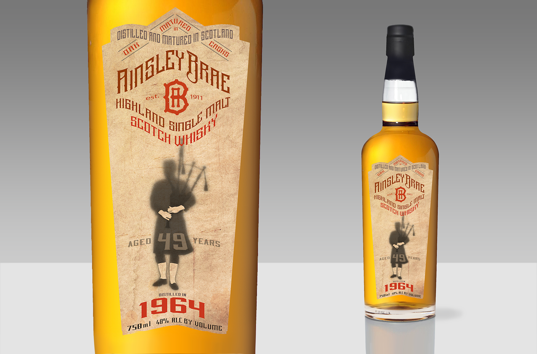
Early development ranged widely before the final identity came together. Four distinct directions were explored in parallel 1) a moody stag-in-mist illustration paired with a vintage numeral badge, 2) a Highland piper silhouette on aged parchment with a folkloric, narrative feel 3) a hand-drawn pot-still sketch rendered in loose artisanal linework against a muted gradient, and 4) arguably the strongest and most distinctive of the four, and the direction that most shaped the identity's final voice.
Rather than converging on the safest or most conventional option, the range-finding process deliberately tested the full spread — from illustrative and folkloric, hand-drawn intimate, and strong, hand hewn typographic treatment with brand mark— the system that carries the brand today, and the range of what let Ainsley Brae scale cleanly across eight-plus finishes without the identity feeling stretched thin.
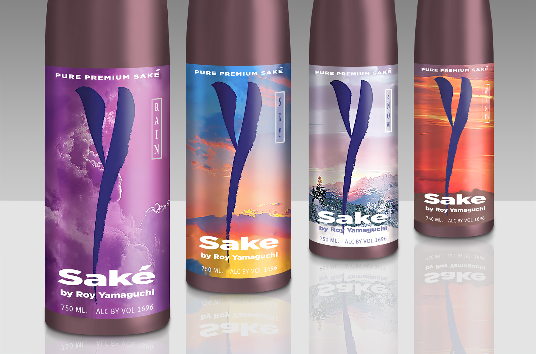
Y SAKE by CHEF ROY YAMAGUCHI. Client: Chef Roy Yamaguchi
The Concept and Collaboration
In the late 1990s and early 2000s, Chef Roy Yamaguchi wanted to challenge the assumption that high-end Japanese sake could only be imported. He envisioned a domestically crafted beverage designed specifically to match the complex, bold flavor profiles of his Hawaiian Fusion cuisine.
To bring this to life, he partnered with SakeOne Corp., operating out of the Momokawa brewery in Forest Grove, Oregon — chosen for a water source whose soft, pristine character closely mirrors the ideal profile traditional Japanese brewmasters look for.
The Launch: The Elements of Nature
The line officially debuted in March 2001 during a high-profile multi-course pairing dinner at The Original Roy's in Hawaii Kai. Rather than following traditional naming conventions, the line was structured around elements of nature to represent a gradient of flavor profiles:
Y Sky — light, crisp, and semi-dry
Y Wind — deeply traditional, very dry, with a subtle scent
Y Snow — a cloudy, unfiltered (nigori) sake, slightly sweet, and the lineup's best-seller
Y Rain — an experimental, contemporary sake infused with real ginger
The creation of Y Sake proved that premium rice fermentation could find a successful home in American craftsmanship, helping pave the way for the broader domestic craft sake movement.
The Design Philosophy
The packaging was purposely structured to break away from traditional Japanese sake aesthetics in order to appeal to a Western audience:
Minimalist Identity — a large, stylized "Y" as the core visual element, prioritizing modern, clean lines over traditional kanji calligraphy
Color-Coded Elements — distinct, nature-inspired colors and treatments for each variation, so consumers could navigate flavor profiles at a glance — a frosted look for the unfiltered Y Snow nigori, and specific color blocking across Y Sky, Y Wind, and Y Rain
Western Wine Influence — bottle shapes and presentation styled to feel at home next to premium wines on an upscale dining table, bridging Japanese heritage and American fusion dining
To see a wider set of concepts I've developed on my own — ideas built knowing they might never see a shelf, just to keep the muscle sharp….